
2·
10 months agoYou’re a genius, man. I hope this works!
Adipocere
You’re a genius, man. I hope this works!
And how would I do that, Linux wizard man?

Yes, it’s helly uncanny
I find Dolphin wy better… But renaming & adding files to new folder is better on Nautilus, but as I don’t care much about renaming anymore, and Dolphin is quick enough to surpass the other feature, meh
We are still at stake zero, I put a root password :P
Edit: in fact, Debian doesn’t allow me to not, except on live version, which it forces me to puts me as a sudo user
I’m not confusing Debian, I use it. What Debian doesn’t come with is the user in the sudoer’s file. sudo is there, the user just isn’t part of it by default.
I installed Debian 11 & 12 on live & non-live versions.
My broadcasted TV from the 2000’s and torrents don’t lie, companies wanting to make their TV shows seem longer do, it’s season 8
I’m sorry x3
But then I would guess .deb packages do too? It’s just the best shortening for Debian xP
sudo apt install menulibre && menulibre
Or: sudo nala install menulibre && menulibre
Also, don’t reboot for any reason, login out and in will do the job for most stuff
Debian comes with sudo! I never installed it and it was already there!
It’s probably just a bug, it tells the same to me, but it also tells I’m subscribed to it too
No problem here using the official Debian repos. Is your problem installing a distro? You didn’t tell them.
Tell me the colours! Even shapes if you want to; and resolution (I mak make mines 720p because my display is old, never thought of sharing them before)
The same for you, @eruchitanda@lemmy.world
Oh, I don’t have the gimp files yet anymore, unfortunately, but I can easily redo it! I could do one blue, white & black for Nix, I think it would fit nicely, but I don’t know which colours use with arch; would I right to shorten it to Arc though? :P
What do you mean by ‘looks like “Web”’? I love orange, it’s flat but not that much and looks kinda saturated (in texture), which is nice to MD me;
I never said it looked great, you are countersaying whom?
Why is ‘Web’ bad?
Oh, you mean the font. I can only say it doesn’t all at all look like an W, but you will disagree and there’s no discussion on that.
Addition: I love comic-like fonts, Comic Relief, Bryndan Book etc
I can only think exactly when Mr. Burns blocked the sun to be the only source of energy in the city
Ew, those pests
I’m just hoping they won’t do nonstop ad to Hulu, like Solar Opposites does
1:01, Fry has 180º neck rotation confirmed
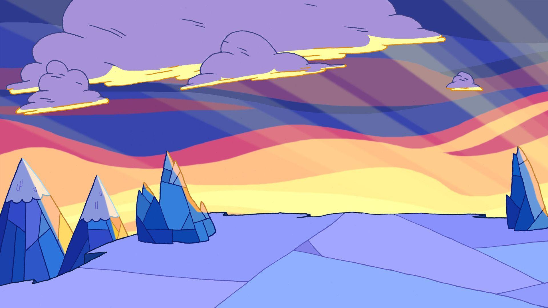
Then would it look like something like this?